How to Turn Image Colors into a Usable Website Palette
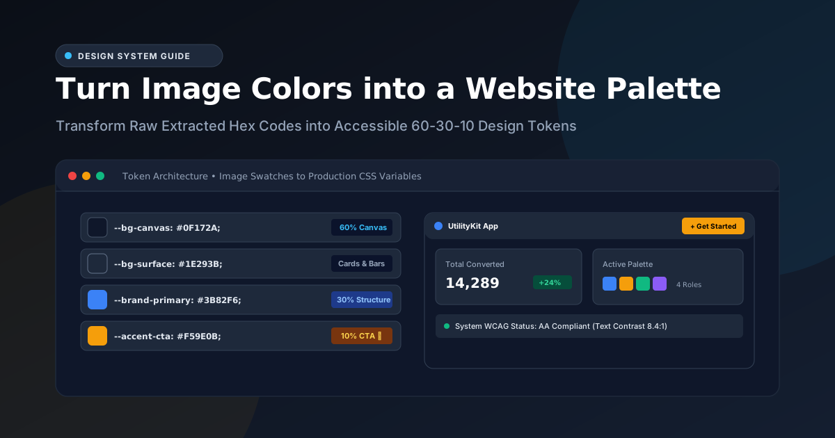
Transform raw extracted photo or logo swatches into an accessible, production-ready website design system using the 60-30-10 rule and CSS custom properties.
Color Picker & Palette Generator
Extract dominant colors from images and generate harmonic color schemes.
You found an inspirational photograph or received a brand logo, uploaded it to the UtilityKit Color Picker, and copied a beautiful set of five extracted HEX codes:
#0F172A /* 44% */
#3B82F6 /* 28% */
#10B981 /* 14% */
#F59E0B /* 9%  */
#EC4899 /* 5%  */
Now comes the real challenge: How do you actually build an accessible, cohesive website interface with these five colors?
Directly applying raw image hex codes to random elements (like making all text #3B82F6 and all borders #EC4899) almost always creates visual chaos, poor legibility, and high bounce rates.
In this guide, you will learn how to translate raw extracted swatches into a scalable design token architecture, apply the classic 60-30-10 Rule, generate interactive tonal scales, and implement your palette directly in CSS or Tailwind CSS.
Step 1: Assign Functional Roles to Extracted Swatches
Every digital user interface requires a predictable visual hierarchy. Rather than treating all five colors equally, assign each extracted swatch to one of four functional roles:
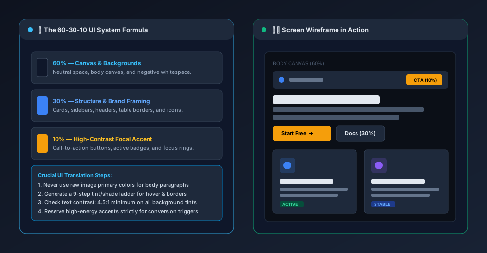
1. The Canvas Neutral (60%)
- Role: Main page backdrop, whitespace, and negative margins.
- Source Selection: Choose the extracted color with the highest area percentage or lowest saturation. In our example, the dark slate
#0F172Aforms the ideal dark-mode canvas (or an inverted off-white#F8FAFCfor light mode). - Goal: Provide a restful, non-distracting foundation that lets content breathe.
2. The Structural Brand Tone (30%)
- Role: Elevated cards, navigation headers, sidebars, secondary buttons, and table rows.
- Source Selection: Choose the primary brand color or secondary mid-tone (e.g.,
#3B82F6). - Goal: Give the application its distinct visual identity and structural framing without overwhelming the reader.
3. The Focal Action Accent (10%)
- Role: Primary Call-to-Action (CTA) buttons, checkout triggers, notification badges, and active tab indicators.
- Source Selection: Choose the highest-contrast, high-chroma color—frequently one of the smaller 5% to 10% swatches, such as
#F59E0B(Amber) or#EC4899(Sunset Pink). - Goal: Immediately guide user eyes to conversion and completion targets.
4. Semantic Status Tones (Alerts & Indicators)
- Role: Success (
#10B981), Warning, Error, and Info states. - Source Selection: Ensure status colors adhere to universal conventions (green for positive states, red for errors) rather than overriding them with arbitrary brand tones.
Step 2: Build a 9-Step Tonal Scale (Tints and Shades)
A single HEX code is never enough for production. For every interactive button, you need:
- Default state
- Hover state (subtle shift)
- Active / pressed state (deeper shift)
- Focus ring (semi-transparent outline)
- Disabled state (desaturated)
To build a tonal scale from an extracted color like #3B82F6, convert it to HSL and adjust the Lightness ($L$) channel:
/* Primary Brand Color: HSL(217°, 91%, 60%) */
--brand-50:  hsl(217, 91%, 95%); /* Subtle card tint */
--brand-100: hsl(217, 91%, 90%);
--brand-200: hsl(217, 91%, 80%);
--brand-500: hsl(217, 91%, 60%); /* Base Extracted Brand Hex */
--brand-600: hsl(217, 91%, 52%); /* Hover State */
--brand-700: hsl(217, 91%, 44%); /* Active / Pressed State */
--brand-900: hsl(217, 91%, 20%); /* Deep text on tinted pills */
[!TIP] In dark mode interfaces, hover states should generally be lighter than the default button, whereas in light mode interfaces, hover states should be darker.
Step 3: Verify WCAG 2.1 Contrast Compliance
Before writing any HTML, test your text and background pairings against Web Content Accessibility Guidelines (WCAG 2.1):
| Content Type | Minimum Contrast (AA) | Enhanced Contrast (AAA) |
| Normal Body Text (< 18pt / 24px) | 4.5 : 1 | 7.0 : 1 |
| Large Text (≥ 18pt or 14pt bold) | 3.0 : 1 | 4.5 : 1 |
| UI Components & Form Borders | 3.0 : 1 | 4.5 : 1 |
Common Traps to Avoid
- White text on yellow/amber buttons: If you select warm amber
#F59E0Bfor a primary button, white text (#FFFFFF) achieves only2.1:1contrast (severe accessibility failure). Use dark slate#0F172Atext on the amber button instead to achieve crisp8.9:1AAA contrast. - Low-contrast placeholder text: Input borders and muted placeholder copy must maintain at least
3.0:1contrast against form input fields.
Step 4: Implement Production CSS Custom Properties
Organize your converted palette into clean, reusable CSS custom properties:
:root {
  /* 60% Canvas & Surfaces */
  --color-canvas-bg: #0F172A;
  --color-surface-card: #1E293B;
  --color-surface-border: #334155;

  /* Typography */
  --color-text-primary: #F8FAFC;
  --color-text-secondary: #94A3B8;

  /* 30% Structural Brand */
  --color-brand: #3B82F6;
  --color-brand-hover: #2563EB;

  /* 10% High-Energy CTA */
  --color-accent: #F59E0B;
  --color-accent-hover: #D97706;
  --color-accent-text: #0F172A; /* High contrast text on accent */

  /* Semantic Feedback */
  --color-success: #10B981;
  --color-danger: #EF4444;
}
If you are using Tailwind CSS, map these variables into your tailwind.config.js:
module.exports = {
  theme: {
    extend: {
      colors: {
        canvas: 'var(--color-canvas-bg)',
        surface: 'var(--color-surface-card)',
        brand: {
          DEFAULT: 'var(--color-brand)',
          hover: 'var(--color-brand-hover)',
        },
        accent: {
          DEFAULT: 'var(--color-accent)',
          hover: 'var(--color-accent-hover)',
          text: 'var(--color-accent-text)',
        },
      },
    },
  },
};
Summary Checklist
- Extract Swatches: Use the Color Picker to sample 5 to 8 balanced colors from your inspirational image.
- Sort by Coverage: Identify your high-coverage neutrals (60%), mid-coverage structural tones (30%), and low-coverage highlights (10%).
- Build Tones: Generate lightness variations for hover, active, and border states.
- Audit Contrast: Ensure body text maintains at least 4.5:1 contrast against its immediate background.
- Tokenize: Export into semantic CSS variables or Tailwind tokens for maintainable styling.
Frequently Asked Questions
Quick answers to common questions for users and search assistants
Can I directly use the extracted HEX codes for website buttons and text?
What is the 60-30-10 color rule in UI design?
How do I create hover and active states from an extracted image swatch?
Related Utilities Mentioned in This Guide
Browse directoryColor Picker & Palette Generator
Extract dominant colors from images and generate harmonic color schemes.
JSON Tools
Format, validate, view in a collapsible interactive tree, and visually edit JSON with draft safety.
Text Diff Checker
Compare two text snippets side-by-side and highlight additions, deletions, and changes.
Continue Reading
Complementary, Analogous, Triadic, and Split-Complementary Palettes
Master color wheel harmonies. Explore the mathematics behind complementary, analogous, triadic, and split-complementary schemes, and learn why wheel harmony does not guarantee WCAG accessibility.
How to Extract a Color Palette from a Photo or Logo
Learn how to extract dominant color palettes from photographs and vector brand logos using median-cut quantization, alpha filtering, and canvas sampling.