Complementary, Analogous, Triadic, and Split-Complementary Palettes
Master color wheel harmonies. Explore the mathematics behind complementary, analogous, triadic, and split-complementary schemes, and learn why wheel harmony does not guarantee WCAG accessibility.
Color Picker & Palette Generator
Extract dominant colors from images and generate harmonic color schemes.
Color theory can feel intimidating when approached through abstract artistic terminology. But in modern digital design and software engineering, color harmony is grounded in straightforward geometry: rotations around the standard 360-degree cylindrical color space (HSL: Hue, Saturation, Lightness).
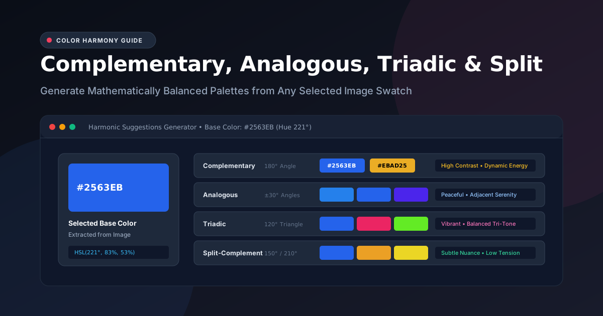
When you use the UtilityKit Color Picker to sample an image, clicking any extracted swatch unlocks four foundational harmonic palette suggestions: Complementary, Analogous, Triadic, and Split-Complementary.
In this guide, you will learn how each harmony is calculated, when to apply each scheme, and why you must never rely solely on color wheel geometry to satisfy accessibility contrast standards.
Understanding the HSL Color Wheel
In the RGB model, colors are defined by red, green, and blue light channels (0 to 255). While ideal for hardware displays, RGB is unintuitive for generating harmonies.
The HSL (Hue, Saturation, Lightness) color model reorganizes RGB into a circle:
- Hue ($H$): The angular position on the color wheel from $0^\circ$ to $360^\circ$ ($0^\circ$ is Red, $120^\circ$ is Green, $240^\circ$ is Blue).
- Saturation ($S$): The purity or vibrancy of the color from $0\%$ (monochrome grey) to $100\%$ (pure, vivid color).
- Lightness ($L$): The brightness from $0\%$ (pure black) through $50\%$ (normal hue) to $100\%$ (pure white).
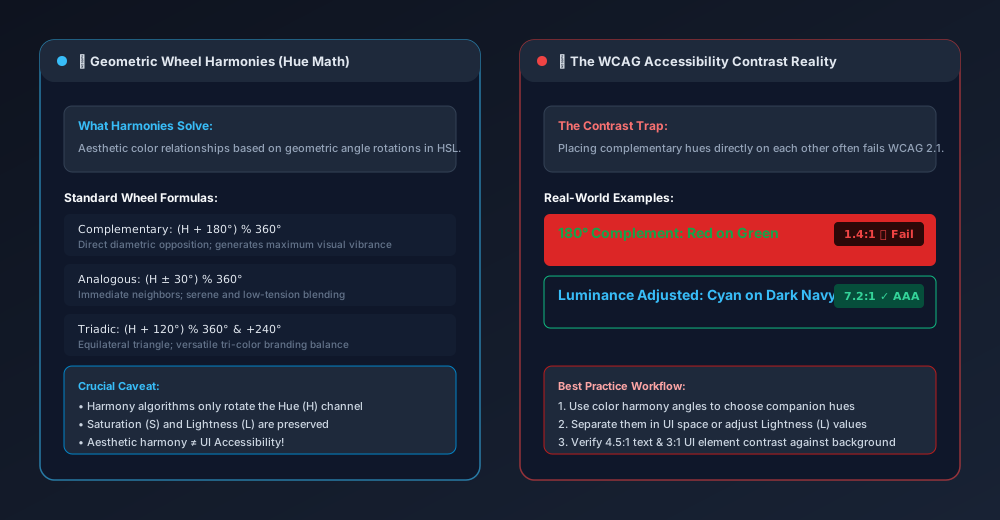
When generating harmonic suggestions, the algorithm locks the base color's Saturation and Lightness values and rotates the Hue coordinate ($H$):
$$\text{Target Hue} = (H_{\text{base}} + \Delta\theta) \pmod{360^\circ}$$
The Four Essential Color Harmonies
1. Complementary Harmonies ($\Delta\theta = 180^\circ$)
A complementary palette pairs a color with the hue positioned diametrically opposite on the color wheel ($180^\circ$ rotation).
- Formula: $(H + 180^\circ) \pmod{360^\circ}$
- Visual Feeling: High contrast, dynamic energy, bold impact.
- Example: Deep Royal Blue (
#2563EB, $221^\circ$) paired with Warm Amber (#EBAD25, $41^\circ$). - Best Use Case: Highlighting focal elements. If your website canvas is predominantly blue, using its warm complementary amber for the primary Call-to-Action button guarantees instant visual detection.
2. Analogous Harmonies ($\Delta\theta = \pm 30^\circ$)
Analogous palettes combine hues located immediately next to each other on the color wheel, typically spaced $30^\circ$ apart.
- Formula: $(H - 30^\circ) \pmod{360^\circ}$, $H$, and $(H + 30^\circ) \pmod{360^\circ}$
- Visual Feeling: Peaceful, serene, organic, and cohesive.
- Example: Azure Blue ($210^\circ$), Royal Blue ($221^\circ$), and Indigo ($250^\circ$).
- Best Use Case: Background gradients, atmospheric landing pages, and editorial content where high visual friction or abrupt contrast would cause eye fatigue.
3. Triadic Harmonies ($\Delta\theta = 120^\circ, 240^\circ$)
A triadic palette consists of three colors spaced equally around the color wheel, forming an equilateral triangle.
- Formula: $H$, $(H + 120^\circ) \pmod{360^\circ}$, and $(H + 240^\circ) \pmod{360^\circ}$
- Visual Feeling: Vibrant, balanced, playful, and stable.
- Example: Sapphire Blue ($221^\circ$), Ruby Rose ($341^\circ$), and Emerald Mint ($101^\circ$).
- Best Use Case: Complex SaaS applications, multi-category dashboards, or brand illustrations where you need three distinct visual categories that feel equally weighted.
4. Split-Complementary Harmonies ($\Delta\theta = 150^\circ, 210^\circ$)
Instead of using the direct $180^\circ$ complement, split-complementary takes the base color and pairs it with the two colors adjacent to its complement ($150^\circ$ and $210^\circ$ rotations).
- Formula: $H$, $(H + 150^\circ) \pmod{360^\circ}$, and $(H + 210^\circ) \pmod{360^\circ}$
- Visual Feeling: Dynamic contrast with lower tension than a direct complement; sophisticated and nuanced.
- Example: Blue ($221^\circ$) paired with Ochre Orange ($11^\circ$) and Golden Lime ($71^\circ$).
- Best Use Case: Designers who want the pop of a complementary scheme without the sharp, vibrating optical tension that direct complements can induce.
Important Distinction: Image Swatches vs. Generated Suggestions
When working in the Color Picker interface, keep this fundamental distinction in mind:
- Dominant Colors: These are colors actually present in your source image. Their percentages reflect the real physical pixel area analyzed on the canvas.
- Harmonic Suggestions: These are algorithmic companions calculated by rotating the Hue channel. They may not appear anywhere in the source photo.
This separation ensures you can both preserve the authenticity of an existing image while expanding it into a full design system.
The WCAG Contrast Trap: Why Wheel Harmony $\ne$ Accessibility
A dangerous misconception among novice designers is that mathematically harmonious colors can be placed directly on top of each other in a user interface.
This is mathematically and perceptually false.
The Red-Green Complementary Failure
Consider Christmas Red (#DC2626) and Meadow Green (#16A34A). On the color wheel, they are complementary ($180^\circ$ opposite). However, if you place green text over a red button:
- Contrast Ratio: Approximately
1.4:1(fails the WCAG AA minimum requirement of4.5:1). - Color-Blind Impact: For users with protanopia or deuteranopia (red-green color blindness), the two colors appear as identical shades of murky brownish-grey, rendering the button completely illegible.
- Chromostereopsis: The extreme difference in light wavelengths causes the human eye to focus on red and green at slightly different depths, producing a disorienting 3D "vibrating" visual vibration along the text edges.
How to Fix Contrast While Keeping Harmony
To make harmonic palettes accessible:
- Never use companion hues as text-on-background pairs directly.
- Adjust Lightness ($L$): If your primary brand color is a mid-tone blue (
HSL: 221°, 83%, 53%), do not use its complement at50%lightness for text. Instead, darken the complement to an ultra-deep shade (L: 10%) or lighten it to a delicate tint (L: 95%) to achieve the required4.5:1(or7:1for AAA) luminance contrast ratio. - Use Neutral Anchors: Place harmonious accent colors onto high-contrast neutral backgrounds (such as
#FFFFFFin light mode or#0F172Ain dark mode).
Quick Reference Summary
| Palette Mode | Wheel Rotation | Psychological Mood | Ideal Design Role |
| Complementary | $180^\circ$ | High energy, sharp focus | CTA buttons, alerts, focal highlights |
| Analogous | $\pm 30^\circ$ | Calm, harmonious, natural | Background gradients, cards, hero sections |
| Triadic | $120^\circ, 240^\circ$ | Balanced, vibrant, structured | Multi-tab dashboards, category tagging |
| Split-Complement | $150^\circ, 210^\circ$ | Nuanced, modern contrast | Landing pages, feature badges, illustrations |
Try selecting an extracted swatch in the UtilityKit Color Picker right now to generate and copy harmonic palettes for your next project.
Frequently Asked Questions
Quick answers to common questions for users and search assistants
What is the mathematical difference between complementary, analogous, triadic, and split-complementary palettes?
Do generated color harmonies represent colors found in my uploaded image?
Does a complementary color combination automatically meet WCAG accessibility standards?
Related Utilities Mentioned in This Guide
Browse directoryColor Picker & Palette Generator
Extract dominant colors from images and generate harmonic color schemes.
JSON Tools
Format, validate, view in a collapsible interactive tree, and visually edit JSON with draft safety.
Text Diff Checker
Compare two text snippets side-by-side and highlight additions, deletions, and changes.
Continue Reading
How to Extract a Color Palette from a Photo or Logo
Learn how to extract dominant color palettes from photographs and vector brand logos using median-cut quantization, alpha filtering, and canvas sampling.
How to Turn Image Colors into a Usable Website Palette
Transform raw extracted photo or logo swatches into an accessible, production-ready website design system using the 60-30-10 rule and CSS custom properties.