How to Use Lorem Ipsum to Test Layouts and Catch CSS Text Overflow
Learn why dummy text is essential for UI design, how to stress-test responsive components, and CSS rules to fix text overflow and flexbox blowouts.
Lorem Ipsum Generator
Generate realistic dummy text, placeholder paragraphs, sentences, and words for layouts.
Every front-end developer and UI designer has encountered the "perfect mockup trap." In Figma or Sketch, the card component looks immaculate: the title is exactly four words, the paragraph is three tidy lines, and the image fits like a glove.
Then the component hits production, connects to real user-submitted content, and immediately shatters:
- A user signs up with a 38-character email address, breaking the table layout.
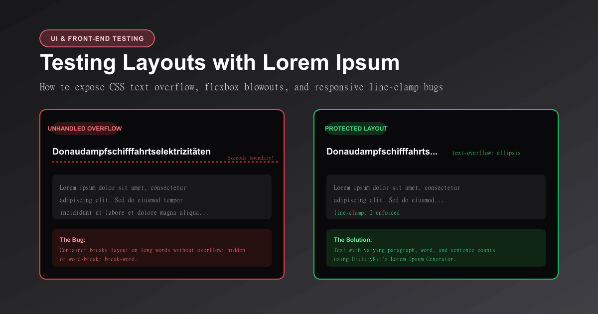
- A German user enters a compound noun like
Donaudampfschifffahrtselektrizitäten, pushing the action buttons off screen. - A product description contains 2,000 words instead of two sentences, causing the card to expand infinitely and misalign the entire grid row.
To prevent these embarrassing production bugs, you must stress-test layouts using structured dummy text.
In this guide, you will learn the psychological rationale behind placeholder copy, how to simulate extreme content edge cases, the four CSS rules that prevent text blowouts, and how to use the free Lorem Ipsum Generator on UtilityKit.
Why Lorem Ipsum: The Psychology of Design Review
The practice of using scrambled Latin placeholder copy dates back to the 16th century, adapted from Cicero's 45 BC philosophical work De Finibus Bonorum et Malorum.
Why has this tradition endured for over five centuries?
- Eliminating Semantic Distraction: The human brain is an aggressive pattern-matching engine. If a mockup reads "Our innovative AI platform empowers marketing teams to scale customer acquisition," stakeholders in a design critique will debate the marketing copy rather than noticing that the font size is illegible on mobile screens.
- Natural Character & Word Distribution: Unlike repeating
"test test test"or"xxxx xxxx xxxx", authentic Latin text exhibits a natural variety of word lengths (from 2-letter prepositions to 12-letter verbs) and letter frequencies. This gives typographic elements like line-height (leading) and letter-spacing (tracking) an authentic visual weight. - Language Neutrality: Scrambled text prevents reviewers from assuming copy length is locked, encouraging engineers to design responsive, flexible containers.
3 Critical Edge Cases to Stress-Test with Dummy Copy
When generating placeholder text in UtilityKit's Lorem Ipsum Generator, do not just generate one standard paragraph. Test these three extremes:
1. The Ultra-Short Minimalist (1 to 2 Words)
- The Test: Generate a single word (e.g.,
"Lorem") or three words. - What to Look For: Does the card collapse awkwardly? Does an empty state icon float out of place? Do button labels shrink to an unclickable tap target?
2. The Unbroken Monolith (Long Words & URLs)
- The Test: Test an unbroken 40-character string (such as an API token, SHA-256 hash, or lengthy German noun).
- What to Look For: Does the word clip, overflow horizontally, or trigger unwanted browser scrollbars?
3. The Novelist (5 to 10 Long Paragraphs)
- The Test: Generate 5 full paragraphs with HTML
<p>tags. - What to Look For: Does the container scroll internally? Does the modal window break past the viewport height? Are adjacent grid cards forced into uneven, mismatched heights?
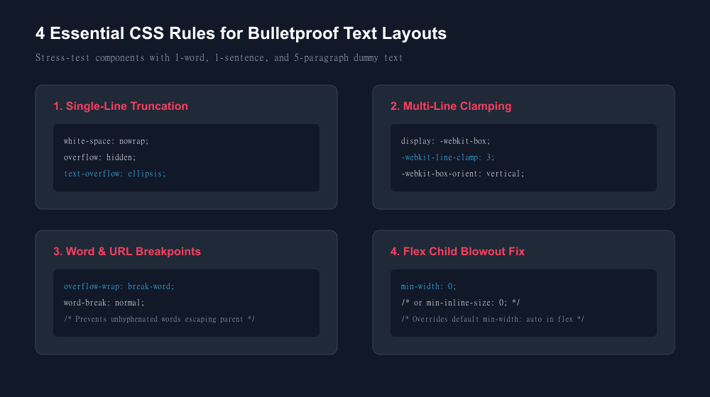
The 4 CSS Rules That Prevent Layout Blowouts
To ensure your web components gracefully handle any length of user-submitted text, incorporate these four modern CSS patterns:
1. Single-Line Truncation (Ellipsis)
Ideal for table cells, user avatars, and breadcrumbs where content must strictly fit on a single line:
.truncate-single {
  white-space: nowrap;
  overflow: hidden;
  text-overflow: ellipsis;
}
2. Multi-Line Clamping
Ideal for blog cards, review previews, and search snippets where you want to allow up to 2 or 3 lines of text before truncating:
.truncate-multiline {
  display: -webkit-box;
  -webkit-line-clamp: 3; /* Truncate after 3 lines */
  -webkit-box-orient: vertical;
  overflow: hidden;
}
3. Safe Word Breaking (No Overflowing URLs)
Prevents long unbroken strings (like file paths, base64 strings, or URLs) from escaping their parent container:
.safe-text {
  overflow-wrap: break-word; /* Modern CSS standard */
  word-break: normal;
}
4. The Flexbox Child Fix (`min-width: 0`)
The most common CSS flexbox bug: by default, flex items have min-width: auto. This means a flex child will refuse to shrink below the intrinsic width of its text content, causing card blowouts. Adding min-width: 0 overrides this behavior and allows truncation to work:
.flex-card-content {
  flex: 1;
  min-width: 0; /* Critical: allows children to shrink and truncate */
}
Step-by-Step: Testing a Component with UtilityKit
- Open the Generator: Go to the Lorem Ipsum Generator.
- Choose Your Generation Mode:
- Paragraphs: Select 1 to 5 paragraphs for body article and modal testing.
- Sentences: Select 1 to 3 sentences for product cards and testimonials.
- Words: Select 3 to 10 words for buttons, badges, and navigation headers.
- Toggle HTML Formatting: If you are pasting directly into a React JSX file or HTML template, check the Include HTML `<p>` Tags option to get clean semantic tags automatically.
- Inspect in Your Browser: Resize your viewport from 1440px desktop down to 375px mobile. Confirm that cards align cleanly and no horizontal scrollbars appear.
Pro-Tip: Clean Text Before Testing
If you are copying real-world customer feedback or web snippets to test your UI alongside dummy text, hidden characters or non-breaking spaces can distort CSS line wraps. Run your copy through our Text Cleaner first to normalize irregular whitespace.
And if you are drafting documentation or README files with placeholder text, check out our guide on how to preview Markdown and catch common formatting mistakes.
Generate Clean Dummy Copy Instantly
Stop manually typing "test text test text" into your designs. Use UtilityKit's free Lorem Ipsum Generator to produce calibrated word, sentence, and paragraph counts with instant one-click copying and optional HTML wrapping.
Frequently Asked Questions
Quick answers to common questions for users and search assistants
Where did the phrase 'Lorem Ipsum' originate?
Why do designers use scrambled Latin instead of actual English placeholder text?
Why does text overflow out of its flexbox container even when width is set to 100%?
Related Utilities Mentioned in This Guide
Browse directoryLorem Ipsum Generator
Generate realistic dummy text, placeholder paragraphs, sentences, and words for layouts.
Markdown Previewer
Live browser-rendered Markdown preview with HTML and plain text export.
Text Cleaner
Remove rogue line breaks, extra spaces, odd characters, and formatting clutter.
Continue Reading
How to Generate UUID v4 IDs in Bulk for Test Data and Spreadsheets
Learn the RFC 9562 UUID v4 specification, how to generate thousands of collision-resistant IDs for mock databases, and how to format them for CSV and SQL.
How to Preview Markdown and Catch Common Formatting Mistakes
Learn the CommonMark and GFM rules that prevent swallowed line breaks, malformed tables, broken task lists, and mismatched code fences.